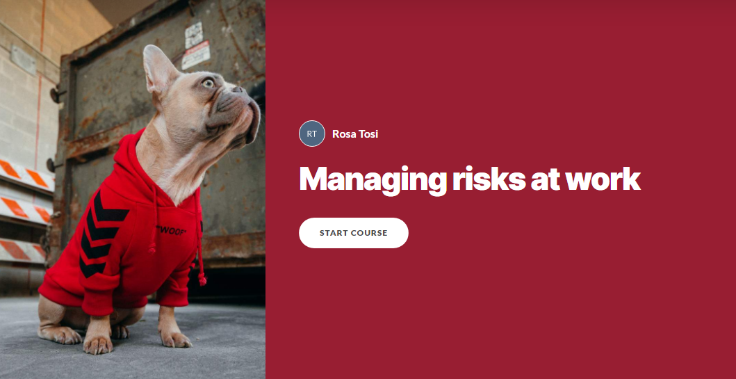
Risk Management
How to manage hazards and risks at the workplace
This is a prototype course created to transform the main contents of this section of the HSE website into a more engaging and memorable experience, in order to help business owners in the UK better handle and report hazards and risks at their company.
The client was a UK company in charge of creating safety trainings and certifications for various businesses in the UK.
Audience: Business owners in the UK
Responsibilities: Instructional Design, Storyboard, Visual Design, eLearning Development
Tools: Articulate Rise, Canva, Vyond, Google Docs
Goal: Correctly manage and report hazards and risks at the workplace in order to minimize injuries and associated costs.
Have a look how I have designed this project below.
Text-Based Storyboard
I didn’t follow my usual process which would include an action map, because this time I didn’t have access to a client directly to solve a company’s problem, I was asked to develop a non company-specific course as a starting point for business owners to get more acquainted with the subject of managing risks at the workplace and make it engaging. I was asked to use the website provided and to expand on the subject as I deemed appropriate using other trustworthy sources as well, and that’s what I did.
I used a storyboard to guide my design process as I usually do and I followed Gagne’s 9 events to structure each section of my course in order to facilitate learners’ understanding and retention.
I have tried to accompany the learner in the following “journey”, step by step:
Understanding concepts/theories about managing risks
Practicing what learned in guided “knowledge checks”
Analyze their own workplace’s hazards and risks independently and make an action plan


Visuals
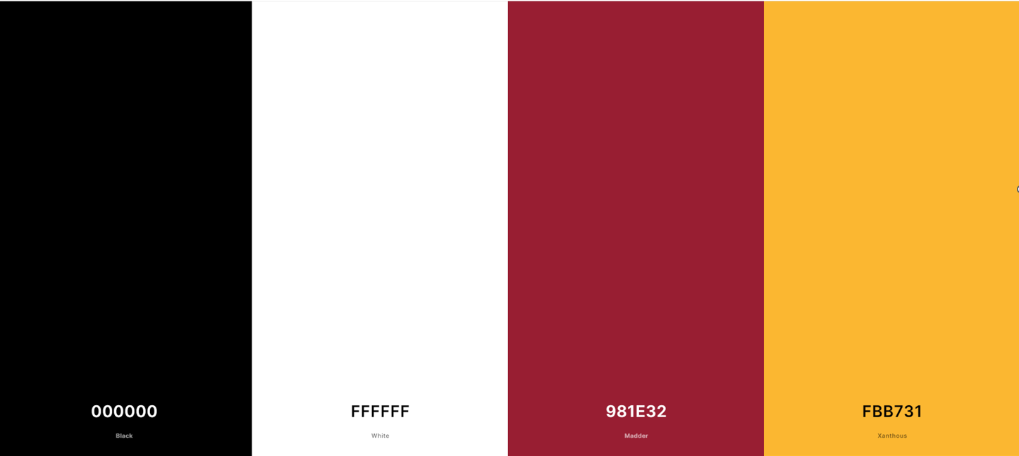
I had to develop a generic course, which could then be customized for every company interested in taking the course as needed at a later time, therefore I have used the colors of the HSE as a starting point.
The HSE brand color is #981E32 (red), and I have chosen #FBB731 (yellow) as the secondary color (beside black and white) because it works well with red but also because it is often used in danger signals, which are seen with hazards at the workplace.
I have used the selected colors to highlight important information, as background colors to create infographics, for the videos and pretty much everything I developed, in order to make everything blend together well.
Results and Takeaways
There are a couple of things I would have wanted to improve or do differently.
First of all, I wish I had the time to develop a video for the introductions to replace the data , I think it would have made the experience more immersive and engaging from the start. I would have liked to use the data + some impactful images to really get the attention of the learners in using the video format.
Having access to the final client or at least the Subject Matter Expert(SME) is also preferable in my opinion, as to collect more feedback and be able to prototype a little more for a more on target final product, but that was not available to me this time so I managed to make it work.
In conclusion though, I was quite happy with the final product since I only had a week to create it, from designing the storyboard to developing the final course with Articulate Rise, including the videos I made with Vyond and the job-aids I designed using Canva, so I think it turned out well for the limited time I had available.
I have received positive comments especially about:
the Vyond videos I developed to show different hazards scenarios for the knowledge check sections; they make the course fun and more relatable, therefore enhancing comprehension and retention.
the think sections, because there learners really get to put into practice risk assessments for their own company. These google docs could be the starting point for drafting a more comprehensive document analysing real hazards and risks, which hopefully will lead to less injuries and time loss at workplaces, which would make this course a success.
the variety of media used: text, videos, flashcards, infographics, quiz and interactions in general.
The Vyond videos I developed to show different hazards scenarios for the knowledge check sections; they make the course fun and more relatable, therefore enhancing comprehension and retention.
Video: lab workers accidentally eats a sandwich bitten by a lab rat.
Example of a biological hazard.

The variety of media : text, videos, flashcards, infographics, quiz and interactions in general.

The think sections; here learners really get to put into practice what they have learnt.
These google docs could be the starting point for drafting a more comprehensive document analysing real hazards and risks at real companies, which should lead to less injuries, making this course a success.